Mobile Ready Websites
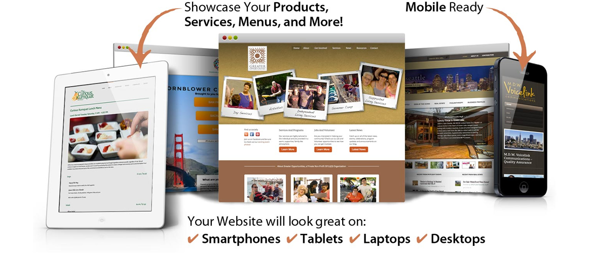
Websites
Web design has changed. Where once you could presume users accessed sites on desktops or laptops, now they could be using any number of devices. That means websites need to be built differently and that takes a different kind of web agency. But, whatever the site and whatever the device, the same set of expertise is required. That is where we can help.
Responsive Design
Responsive design is a front-end development technique that delivers website content to different devices in a manner that is optimized for the screen width of the device. Key to this approach is that a website’s visual appearance/layout can be tailored to each device, without the need for a separate “mobile” versions.
A responsively designed page will rearrange content constantly as the screen changes size. While specific screen sizes can be defined where a page changes layout, taking a ‘responsive’ design approach means that a site will be optimized for all potential screen dimensions.
This offers a degree of future proofing. This is worth considering as new mobile devices are constantly being released and we don’t know what size the next shiny new device will be! Legit Coder can retrofit responsive design to existing websites. This may mean preselecting screen widths when layouts change, other than the design continually changing, but it will still deliver optimized content to tablet and smartphone devices.
Mobile Apps
Typically built with HTML5, CSS3 and JavaScript, web apps such as Twitter provide the ability to tailor content delivered to mobile devices rather than simply re configuring the same content that a desktop user would receive. Web apps will work on any devices that support modern mobile web browsers making them universal, cross platform applications. This maximizes potential audience reach with a single implementation rather than having to develop separate versions for different platforms such Android, iOS or Windows Phone. This reduces development costs.
However, web apps can provide a limited user experience. For example, web apps are unable to use device specific technologies such as a camera. Web apps provide the opportunity to offer mobile users their own tailored experience. However, as this is essentially a separate implementation from a standard web site it is likely to be more costly to implement than a responsive design option.
We are Mobile Specialists
Everybody is talking mobile. Smart phones and tablets are changing the way that users interact with content and online services. 45% of people interact with online content while out and about. That rises to 70% for 16-25′s. Online providers must engage with this emerging market or face losing customers. So what are the options?